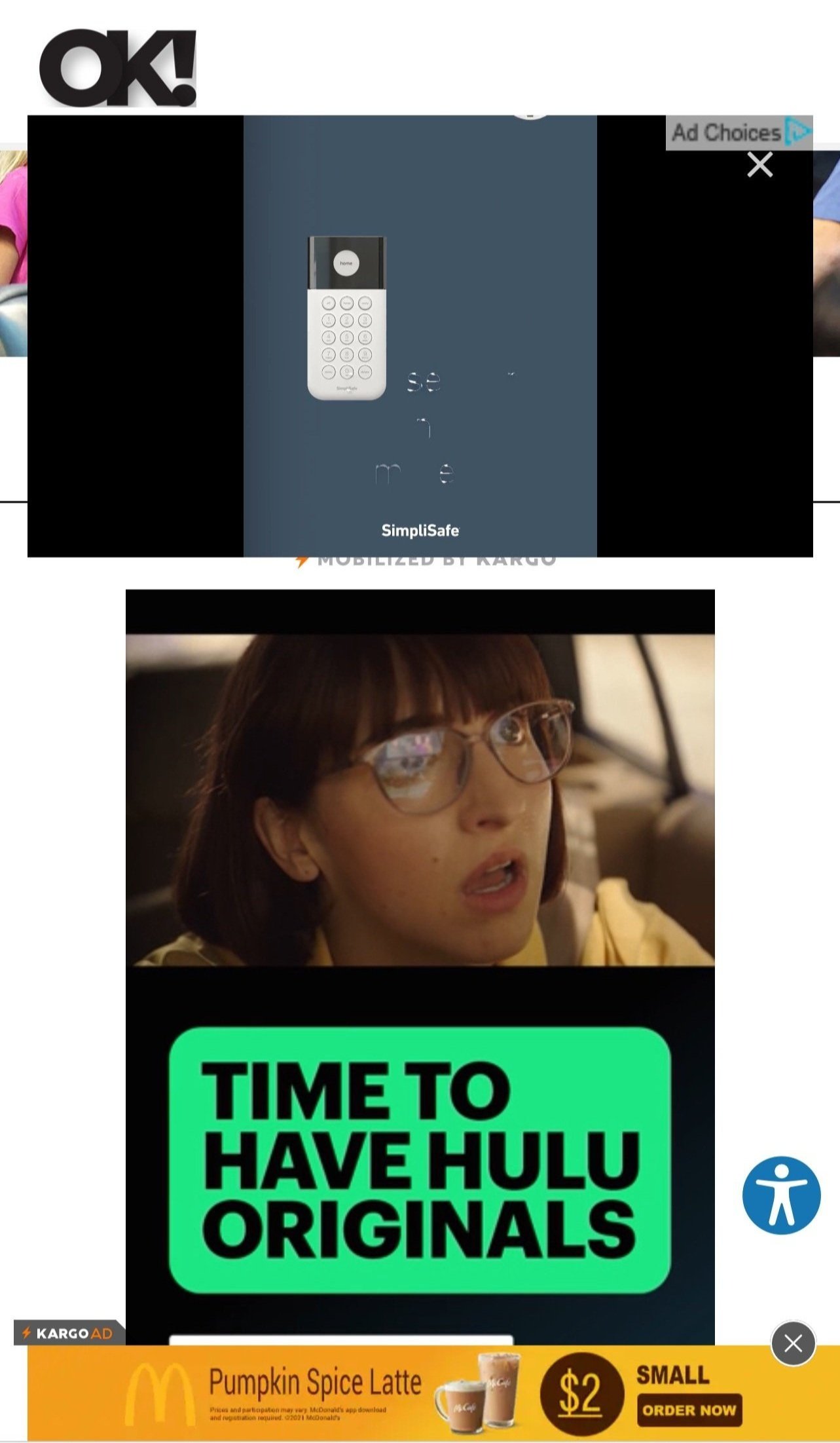
When Did Ads Start Making Internet Articles Literally Unreadable?
by Marissa Pomerance
Hi. I’m Marissa. I’m a frequent reader of internet articles.
I also write them for The Candidly, so I know I’m biased towards this blissfully readable, clean, ad-free site (with minimal, limited pop-ups) that I help program and am now shamelessly promoting in service of critiquing the eye-crossing designs of other sites.
But it’s not just me. You’ve probably noticed this semi-new phenomenon, too. You know, the one where internet articles have become LITERALLY unreadable?
And no, I’m not talking about internet division or misinformation or terrible writing (those are problems for another day). I’m talking physically unreadable.
I’m really not trying to be a smug, self-righteous a*hole, but just take a look, ok?
I mean, WHERE in the above photos is the actual “article?” How do you read the “text” or see the “photos?”
Sure, it’s some mind-numbing story detailing the exact kut, kolor, and karat size of Kourtney Kardashian’s engagement ring that I MUST SEE NOW for some shameful reason, which I chose to click into from an Instagram photo featuring 57 million red roses from Travis Barker’s “intimate” proposal, so maybe I deserve to be confronted with 47 ads for truly grotesque sneakers and SimpliSafe and McDonald’s pumpkin spice lattes. Almost like a punishment for my banal, celebrity-driven curiosity.
But why even go through the minimal effort of putting words on a webpage and clicking “publish” when the webpage isn’t visible to human eyes?
This isn’t just an iPhone safari or trash-website phenomenon, either. This is happening everywhere, on legitimate sites that we look at on our good ole’ fashion laptops we’re glued to for 8-12 hours a day, clicking onto random links from Facebook and Twitter when we need a break from google docs and emails. Like this actually well-written and thoughtful article from a known digital publication:
At least, I think it was well-written and thoughtful. I only got through about 3.5 sentences before this full page pop-up blocked my view of the rest. Important question—where is the “X” button? Oh that’s right, there IS none! How do you get rid of the ad then, you ask?
Turns out, I had to zoom out on the page (no, scrolling up didn’t work) to FIND the “X” button. So user-friendly and obvious, right?!
Or, let’s look at THESE ones, from sites focusing on fashion and style:
How does one take #inspo from these outfits when the pop-ups BLOCK the header text? Or when we can only see a steering wheel and a single crossbody bag at a time because the photos are smushed down to the tiny fraction of page not invaded by ads?
If we have to scroll to see each separate element inch by inch, doesn’t that sort of defeat the entire purpose of looking at the totality of an “outfit”? Carrie Bradshaw wouldn’t approve.
I get that websites have to make money. Media is getting harder and harder. Attention spans are shorter. Content abounds every second of every day. Hell, 74% of you probably ex’d out of this article already in pursuit of your next dopamine hit.
Whether we like it or not, ads are STILL an important way to make money for websites. And while it’s worth having the debate of whether websites should be ad-supported or does that make them biased or is that just ruining algorithms even more, we’re not going to get into that here.
Instead, we’re asking the simple questions, like, “why must ads block the only words we’re trying to read?” “Isn’t the bare minimum of operating a website that pages shouldn’t be physically obstructed, rendering the website unusable?” And “how many minutes must one person spend being tortured by a sneakily-placed ‘X’ button so they can read about Ben and Jen’s matching outfits in peace?”
Just imagine the kind of idyllic, magical world we could live in if businesses thought deeply (or at all!) about our user journeys and designed things that were real, useable, and valuable to our lives. (*Cough another shameless plug for The Candidly cough*). Thoughtlessness towards consumers (other than mining us for lucrative data)—especially towards women—could also take up the length of 15 of our articles, but we’ll leave that for another time, too.
Instead, I’ll give you another peak behind The Candidly curtain; we usually like to end our articles with a takeaway. Something that the reader (you) can take forth into your life, or take action on, or learn from.
Well, today I don’t really have a takeaway. I have a plea:
Dear Internet,
We all know you’re broken. So broken. You desperately need fixing.
I may not be smart enough to try to fix all your problems with division and misinformation and biased algorithms and AI that will inevitably rise up and take over the world.
But can you do this one, small thing at least? Can you make articles physically readable again? Please?
Sincerely,
Marissa
P.S. If you want to sign onto this plea/petition, feel free to comment below. Maybe the rest of the Internet will catch on eventually.
Marissa Pomerance is the Managing Editor of The Candidly. She’s a Los Angeles native and lover of all things food, style, beauty, and wellness. You can find more of her articles here.


